
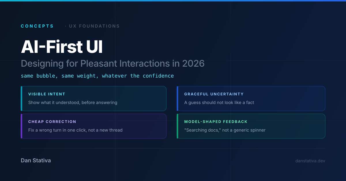
The chat window is the wrong default for AI-first products
Every UI generation unlearns the previous generation's defaults. AI-first products in 2026 are still unlearning the chat window. This article sets the bar for what pleasant means in human-AI interaction.
- Beyond the chat window paradigm
- Latency as a design constraint
- Error states as first-class UI
- Progressive disclosure for AI output
- Feedback loops and trust calibration

Abstract: Most AI-first interfaces still borrow their vocabulary from forms and chat windows: a text box, a send button, a spinner. But a pleasant model interaction is not a chat skin over an API call — it is its own UX discipline. This article asks what “pleasant” actually means when the thing on the other end of the interface reasons in probabilities rather than rules, and what that implies for the UI elements engineers will need to design well in 2026: visible intent, graceful uncertainty, cheap correction, and feedback that matches how a model actually behaves instead of how a form does.
Every UI generation inherits the vocabulary of the one before it. Web forms borrowed from paper forms. Mobile apps borrowed from desktop windows, then spent a decade unlearning that habit. AI-first products are doing the same thing right now — and the habit they need to unlearn is the chat window.
1. The Habit We Inherited
A text box. A send button. A spinner. A wall of text that may or may not be true.
That is the default shape of an “AI-first” interface today, and it is borrowed almost entirely from two older patterns: the web form and the messaging app. Neither was designed for a system that reasons in probabilities. A form assumes the backend either accepts or rejects your input. A chat app assumes the thing replying is a person who understood you.
A model does neither. It produces a plausible answer, with a confidence that the UI usually throws away the moment the response is rendered.
The mismatch: chat UI presents every model response with the same visual certainty — same bubble, same font weight — whether the model is 95% sure or barely guessing. The interface is lying about how much to trust it.
2. What “Pleasant” Actually Means
“Pleasant” is not the same as “frictionless.” A frictionless interface that confidently gives you a wrong answer is not pleasant — it is a trap. A pleasant interaction with a model has a narrower, more specific definition: the interface tells you the truth about what the model is doing, at the moment you need to know it.
That breaks down into four concrete properties.
| Property | What it means | What breaks without it |
|---|---|---|
| Visible intent | The UI shows what the model believes you asked, before committing to an answer | Users correct a misunderstanding only after reading a wrong answer |
| Graceful uncertainty | Low-confidence answers look different from high-confidence ones | Users can’t tell a guess from a fact |
| Cheap correction | Fixing a wrong turn costs one click, not a new conversation | Users abandon the thread instead of repairing it |
| Model-shaped feedback | Loading, error, and retry states reflect what the model is actually doing (retrieving, reasoning, calling a tool) | A generic spinner hides whether the system is thinking, stuck, or about to fail |
None of these are exotic. They are the same UX instincts that good forms have always used — inline validation instead of a rejected submit, a progress indicator instead of a blank screen. The difference is that “valid” is no longer binary, so the UI has to learn to represent a gradient.
3. The Mobile-First Parallel
This is not the first time an interface paradigm has had to be rebuilt from the ground up instead of skinned over an old one. Mobile-first design went through the same forcing function: constrained input, constrained attention, no room to fake competence with a hover state. Roger Attrill’s piece on AI-first design draws that parallel directly, and it is the inspiration behind this article’s framing.
Curated Source

AI-First Design: Lessons from the Mobile-First Mindset
Attrill’s argument is that mobile-first was never really about screen size — it was about designing for core functionality first, under real constraints, then enhancing outward. AI-first asks the same discipline of designers, except the constraint is trust instead of pixels.
"Designing 'AI-first' products demands a fundamentally different approach to traditional applications."Read the original piece
He also flags the mistake mobile design eventually had to correct: years of isolated, siloed app experiences that didn’t talk to each other. AI-first products are at risk of repeating exactly that mistake — one assistant per product, each with its own memory, its own context, none of it shared — unless interoperability is treated as a UX requirement from the start, not an afterthought.
4. From Mobile-First Lessons to AI-First UI Elements
Mapped directly onto interface decisions, the parallel gets concrete fast.
| Mobile-first lesson | AI-first UI implication |
|---|---|
| Design for core functionality first, enhance outward | Design for the model’s most common, lowest-confidence case first — not the demo-perfect prompt |
| Respect environmental constraints (one thumb, bad signal) | Respect cognitive constraints (limited patience for ambiguity, no tolerance for silent failure) |
| Progressive enhancement over graceful degradation | Progressive disclosure of model reasoning — show more as confidence and context grow |
| Avoid siloed, non-interoperable apps | Avoid siloed, non-interoperable assistants — shared context beats another walled chat window |
5. New UI Primitives for 2026
If chat bubbles and spinners are the wrong inherited vocabulary, the next generation of AI-first interfaces needs its own primitives. A few that are already showing up in serious products:
intent preview     -> "Here's what I understood. Adjust before I answer."
confidence surface  -> visual weight that scales with p(success), not a flat bubble
inline citation     -> the retrieved source sits next to the claim, not behind a link
one-click repair    -> correct a turn without restarting the conversation
state-aware waiting -> "Searching docs" / "Calling tool" instead of a generic spinner
escalation handoff  -> a visible, dignified path to a human when confidence drops
None of these require a bigger model. They require treating the interface as a place where uncertainty is shown, not hidden — which is a design problem, not a model problem.
Core idea: raising the UX bar for AI-first products is not about making the model feel more magical. It is about making the interface tell the truth about what the model is doing, as plainly as a good form tells you why a field failed validation.
6. Closing
Mobile-first did not win because phones got bigger screens. It won because designers stopped treating mobile as a smaller desktop and started designing for its actual constraints. AI-first interfaces are at the same fork. The chat window is this generation’s “smaller desktop” — a familiar shape that hides how different the thing underneath actually behaves.
The bar for pleasant AI-first UX in 2026 is not cleverness. It is honesty, rendered in pixels: show the intent, show the confidence, make correction cheap, and never let a spinner stand in for an explanation.